| IN A NUTSHELL |
|
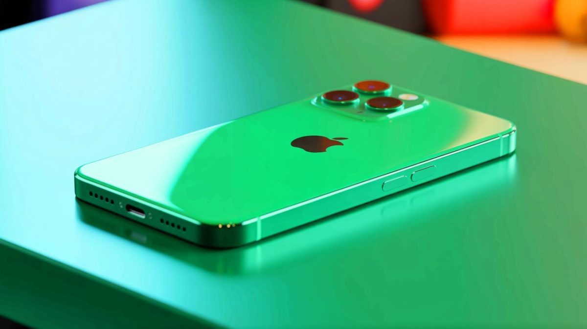
Apple has long been a trendsetter in the technology space, particularly when it comes to aesthetics and design. With the introduction of the iPhone 17, the company is once again making headlines. This time, it’s all about color. Apple’s latest release is generating buzz for its vibrant and bold color options, especially a new, striking shade of green. This shade promises to redefine what consumers expect from smartphone design. The evolution of color in Apple’s devices raises questions about consumer preferences and the role of aesthetics in technological innovation.
The Evolution of Color in Apple’s iPhones
Apple has a history of experimenting with color, but recent years have seen more muted tones in their iPhone lineup. The iPhone 15 and iPhone 16 featured colors that many considered understated. The iPhone 15’s green, for instance, was described as more mint-like than a true green. This subtlety in color choice was a deliberate design decision by Apple, aligning with the company’s minimalist aesthetic.
However, the iPhone 16 introduced Ultramarine, a bolder color that signaled a potential shift in Apple’s design philosophy. The iPhone 17 takes this shift further with its vibrant green, making a clear departure from the muted tones of its predecessors. This change is not just about aesthetics; it’s about making a statement. Apple’s decision to embrace brighter colors reflects broader trends in consumer electronics, where personalization and self-expression are increasingly important.
Consumer Reactions to the New Color Palette
The introduction of the iPhone 17’s new color palette has sparked diverse reactions among consumers. A recent online survey highlighted these opinions. According to the results, 54.39% of respondents prefer the new green over the previous iPhone 15’s version. Only 12.28% favored the older, more muted green, while a notable 26.32% expressed dissatisfaction with both options.
These figures suggest that while many consumers welcome Apple’s bold new direction, a significant portion remains unconvinced. This split highlights the challenge Apple faces in appealing to a broad audience with varying tastes. The company has always been adept at setting trends, but as consumer preferences become more diverse, Apple must balance innovation with tradition to maintain its edge.
Comparisons With Competitors
Apple’s color choices do not exist in a vacuum; they are part of a larger industry trend. Competitors like Samsung have also faced criticism for diluting their color palettes. Much like Apple, Samsung has attempted to strike a balance between innovation and appeal to a wide consumer base. The introduction of more vibrant colors in the iPhone 17 can be seen as a response to this competitive landscape.
In contrast, some competitors have taken the opposite approach, offering a wider array of bold colors as a way to differentiate themselves. This strategy highlights the ongoing debate within the industry: Should companies stick to timeless, classic designs, or should they embrace more daring, experimental aesthetics? Apple’s recent choices suggest the company is willing to take risks to maintain its status as a design leader.
The Future of Smartphone Design
The iPhone 17’s color options, including a new orange for the Pro model and the intriguing Liquid Glass variant, signal a potential new direction for Apple’s design philosophy. The Liquid Glass model, rumored to reflect differently under various lighting conditions, could be a game-changer in smartphone aesthetics. This innovation points to a future where color is not static but dynamic, offering users a more interactive experience.
Such advancements raise interesting questions about the future of smartphone design. As technology evolves, how will companies like Apple continue to push the boundaries of what is possible? Will color and material innovations become a key differentiator in an increasingly competitive market? These are crucial considerations as Apple and its competitors look to the future.
As Apple continues to innovate with its color choices, it’s clear that the company is committed to maintaining its reputation as a leader in design. The iPhone 17’s vibrant palette is a bold step that aligns with broader consumer trends towards personalization and self-expression. As we look forward, the question remains: How will Apple continue to surprise and delight its customers with future design innovations?
Did you like it? 4.5/5 (22)


Wow, the iPhone 17 sounds amazing! But is the green really that different from the iPhone 15’s version? 🤔
Love the bold color choices, but what about battery life improvements? Priorities, Apple! 😅
Finally, a vibrant green! Apple should have done this ages ago. Thank you! 😊
Is the Liquid Glass variant just a gimmick or does it actually improve the user experience?