| IN A NUTSHELL |
|
In the ever-evolving world of technology, even subtle changes can have a profound impact on user experience. Recently, Google Maps, a vital tool for navigation on both Android and iPhone devices, underwent a minor yet significant design modification. This update, although seemingly small, underscores Google’s ongoing commitment to refining its brand identity and enhancing user interaction. As Google continues to innovate, such changes reflect broader trends in the tech industry, emphasizing simplicity and clarity. Let’s delve deeper into what this latest update entails and its implications for users worldwide.
The New Look: A Subtle Yet Significant Change
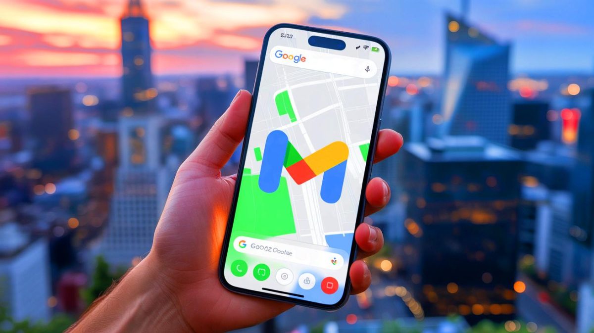
Google Maps has long been a staple for those seeking reliable navigation, and now it comes with a fresh design tweak. The most noticeable change is the transformation of the Google Maps logo, which appears at the bottom left of the app interface. Previously, the logo featured Google’s traditional vibrant colors—red, yellow, blue, and green—without the word “Maps.” Now, the logo has adopted a more understated gray palette, with “Google” emphasized in bold next to “Maps.” This shift not only modernizes the look but also compartmentalizes Google’s ecosystem more effectively.
If you’re using dark mode on your smartphone, this new logo stands out even more. It appears in white, with pronounced gray outlines around each letter, ensuring visibility without overwhelming the user interface. For those eager to experience this update, it requires installing version 25.21 for Android and version 25.22 for iOS. Despite the logo’s makeover, other elements like the iconic Maps pin, Google Lens icon, and account photo remain unchanged, preserving their colorful design.
Google’s Branding Strategy: A Move Toward Simplicity
This change in Google Maps is part of a larger strategy by Google to streamline its branding and visual identity. Just last month, Google adjusted the logo of its search engine for the first time since 2015, introducing a progressive color gradient. Such updates are not merely cosmetic; they convey Google’s transition into the era of artificial intelligence, where clarity and ease of use are paramount.
By adopting a more minimalist design, Google aims to enhance user trust and accessibility. The new logo design aligns with contemporary design trends, which favor simplicity and functionality over complexity. This strategic branding approach helps Google maintain its position as a leader in technology, constantly adapting to the needs and preferences of its global user base.
Adapting to User Preferences: The Role of Dark Mode
Dark mode has become a popular feature among users, offering a more comfortable viewing experience in low-light environments. Google’s decision to adapt its Maps logo for dark mode users reflects its commitment to catering to diverse user preferences. The use of a white logo with gray outlines ensures that the brand remains visible and recognizable without detracting from the overall user experience.
This adaptation not only enhances visibility but also conserves battery life on OLED screens, making it a practical choice for many smartphone users. As more apps and platforms embrace dark mode, Google’s proactive approach ensures that it remains at the forefront of user-centric design.
Looking Ahead: What This Means for Google’s Future
As Google continues to refine its branding and design, users can expect to see more changes across its product lineup. These updates are indicative of a broader shift towards a seamless, integrated user experience. By focusing on clarity and simplicity, Google not only enhances its brand identity but also strengthens its connection with users.
The subtle yet impactful changes in Google Maps serve as a reminder of the company’s ability to innovate and adapt in a rapidly changing technological landscape. As we look to the future, it will be interesting to see how Google continues to evolve its brand and products in response to user feedback and emerging trends.
With these updates, Google Maps is not just a navigation tool but a reflection of Google’s ongoing journey towards innovation and excellence. How will these design changes influence your experience with Google Maps, and what do you hope to see in future updates?
Did you like it? 4.6/5 (28)


Why does Google always change things just when I get used to them?
How come most users didn’t notice this? 😅
Personally, I think the new logo looks sleek and modern. Good job, Google! 👍
Honestly, I miss the old vibrant colors. This gray just seems dull. 😕
Does this mean Google will make other apps gray too? What’s next, Gmail? 😜